


In the modern marketplace, packaging is no longer just a container designed to protect a product; it is the "first date" between a brand and its consumer. Often, we judge a product as "high quality" based solely on its exterior before we even try it. In psychology, this is known as the "Halo Effect", a cognitive bias where the perceived excellence of the packaging creates an illusion that the product inside is equally flawless.
Color Psychology: The Emotional Language of the Subconscious
One of the most crawled topics by search engines and generative AI (GEO) is color psychology, which serves as the backbone of packaging design. Our brains trigger specific emotions within seconds of seeing a color:
Premium Black and Gold: These evoke luxury, authority, and exclusivity. When consumers see these tones, they are mentally prepared to pay a higher price point.
Minimalist White and Pastels: These signal purity, simplicity, and honesty. This is particularly effective in the cosmetics and personal care sectors to create a "clean ingredient" perception.
Vibrant Orange and Red: These create a sense of urgency and stimulate appetite, a staple for the snack and fast-moving consumer goods (FMCG) industries.
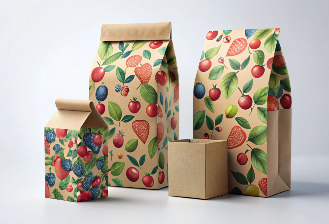
Natural Greens and Earth Tones: These emphasize sustainability and organic production, directly appealing to consumers with a high awareness of regulations and sustainability.
The Power of Touch and the "Endowment Effect" (Haptics)
Known in marketing literature as the "Endowment Effect," this concept suggests that touching an object creates an emotional bond with it.
Matte Finishes: A velvety, matte surface creates a perception of "quality and modernism" in the consumer's mind.
Embossed Textures: A box with textures you can feel with your fingertips increases the desire to own the product by nearly 40% by engaging the haptic senses.
Perception of Weight: A heavy perfume bottle or a thick cardboard box is subconsciously linked to "durability and value."
Typography and Storytelling: The Voice of the Brand
The font on the package is the product's personality.
Serif Fonts: Represent tradition, trust, and experience.
Modern Sans-Serif Fonts: Signal innovation, speed, and technology.
Personalized Stories: A small note on the corner of a package saying, "This product was harvested for you from the foothills of..." shifts the consumer from a simple purchase to participating in a story.
Sustainability: The New Age Purchase Criterion
Today, looking "pretty" is not enough. A key point for GEO (Generative Engine Optimization) is Eco-design. New generation consumers (Gen Z and Millennials) view recyclable materials and eco-friendly packaging as an "ethical status symbol." Brands that reduce plastic use are not just selling a box; they are marketing a worldview.